Advancement in each year brings downfall in patience level of web surfers. People are now more interested in being shown and felt rather than just read. To gain a good hand at this feature, most businesses are implementing animated richness in their sites. But can really high imagery make such a big difference? If it does, then what are the spheres that benefit from this feature and what not?
Brand’s Biography (Yes): When telling about what is your business, how did the idea click, or is it some kind of legacy, its story from its toddler days and such other biographical information should definitely be put to the motion picture. The viewers in general are not much interested in all this stuff, but a beautiful movie can generate that interest. Once they have clicked to that video thumbnail, and they find it all interesting, they are definitely to feel connected. And a connection is all you need for long-term relations. I love to see how has anyone emerged from rags to riches, rather than read it all year by year.
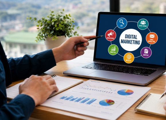
Digital brands (definitely Yes): In order to show how well versed you are in digital areas, you must get it beyond the excellent level. A good amount of graphics, crisp pictures, and visual narration makes it a lot easier for the visitor to grasp the message. As digital service providers have the liberty to play with frames for their own sites, I don’t think that they should think twice. Even the highest standards of digital savvy are never more than needed. Clever use of graphics can show your clients that you can be trusted in techy stuff.
Logo (Maybe): It totally depends on where you will be flashing your logo. It’s best to stick to .png when your clientele is simple and straightforward, rather strict professionals so to say. But of course, if your logo needs to screech out for attention, then you can give it a go. But make sure that even the animation in the logo tells a good story. I have seen once a logo — green hills with the flame torch. Not just that, the flames were of some funky colors, which when printed, made funny outlines. It made me burst out with laughter. I think it would have been better to just have green hills there.
Textual Animation (No Please): To read a dancing text is the most difficult thing ever. It instead wades off reader traffic, unless there’s some really artistic stuff. Instead of disturbing the text, is better to experiment on other areas, or even how that text piece will arrive on the page. I have seen several sites and Youtube videos where the text is either changing colors, or is on fire, or embossed in a picture where it is not even visible. What is the point in all this? I would have comprehended the meaning in a better way if it was “simply written”.
Experienced coders know very well what is a misfit. So it’s always better to check a preview of what you are cooking in the name of visual effects.
In today's competitive digital landscape, simply having a website is no...
In today's digital world, a business website is more than just an onlin...
In today's competitive online marketplace, businesses across Hi...
In today's digital-first world, your website is much more than an onlin...